Etuovi
2018
Real-estate website redesign
Etuovi’s real estate website is a major Finnish platform for buying, selling and renting a housing. However, their website is outdated. Therefore, I decided to make it my personal project and redesign it.
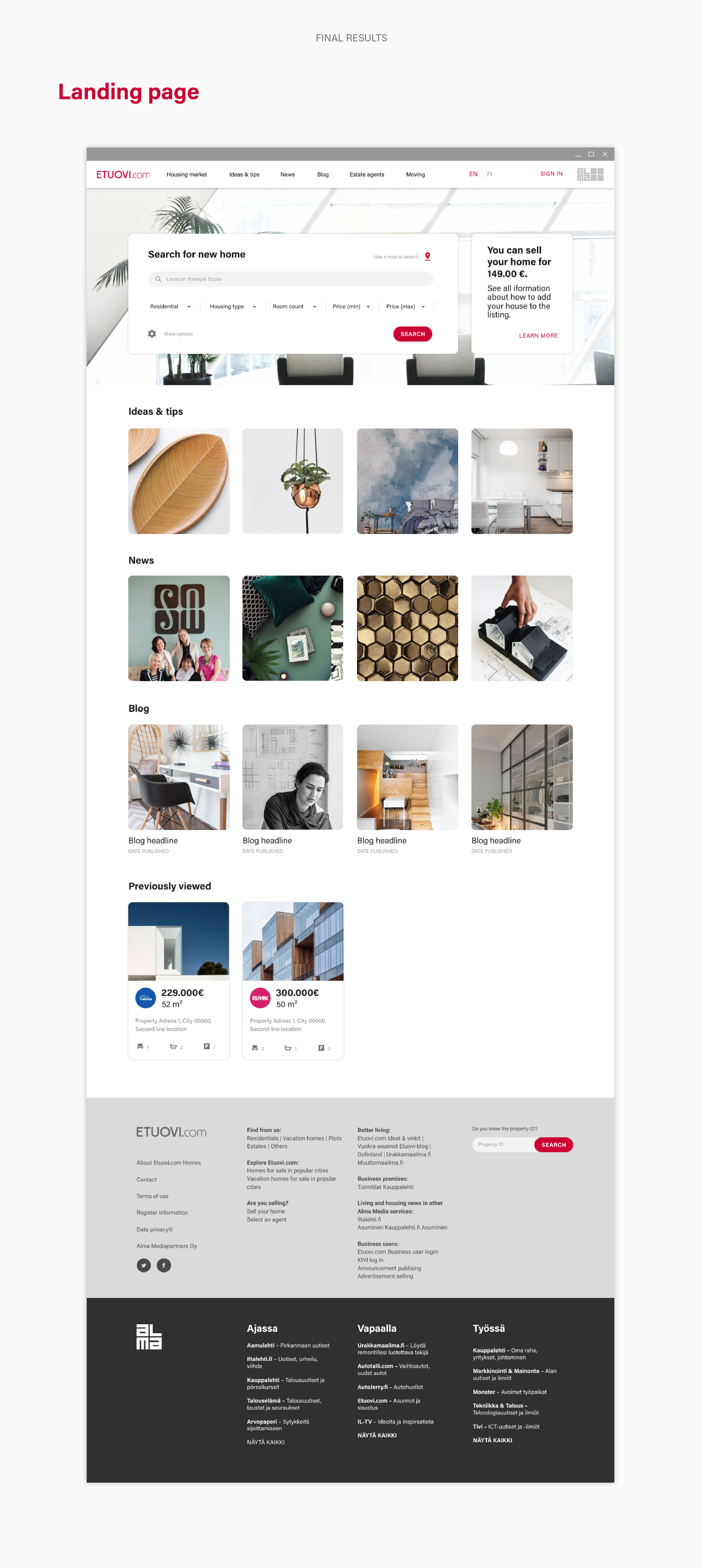
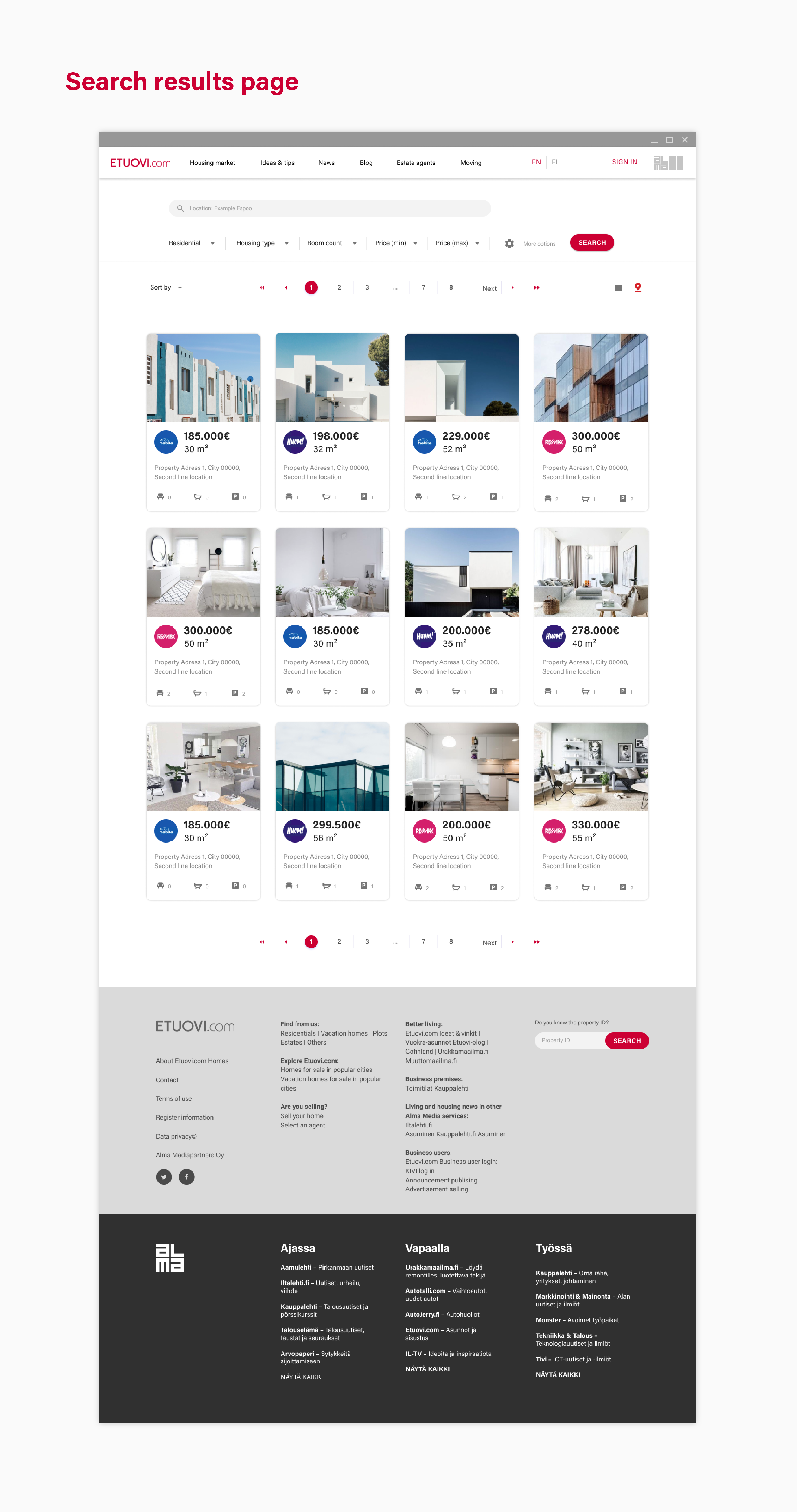
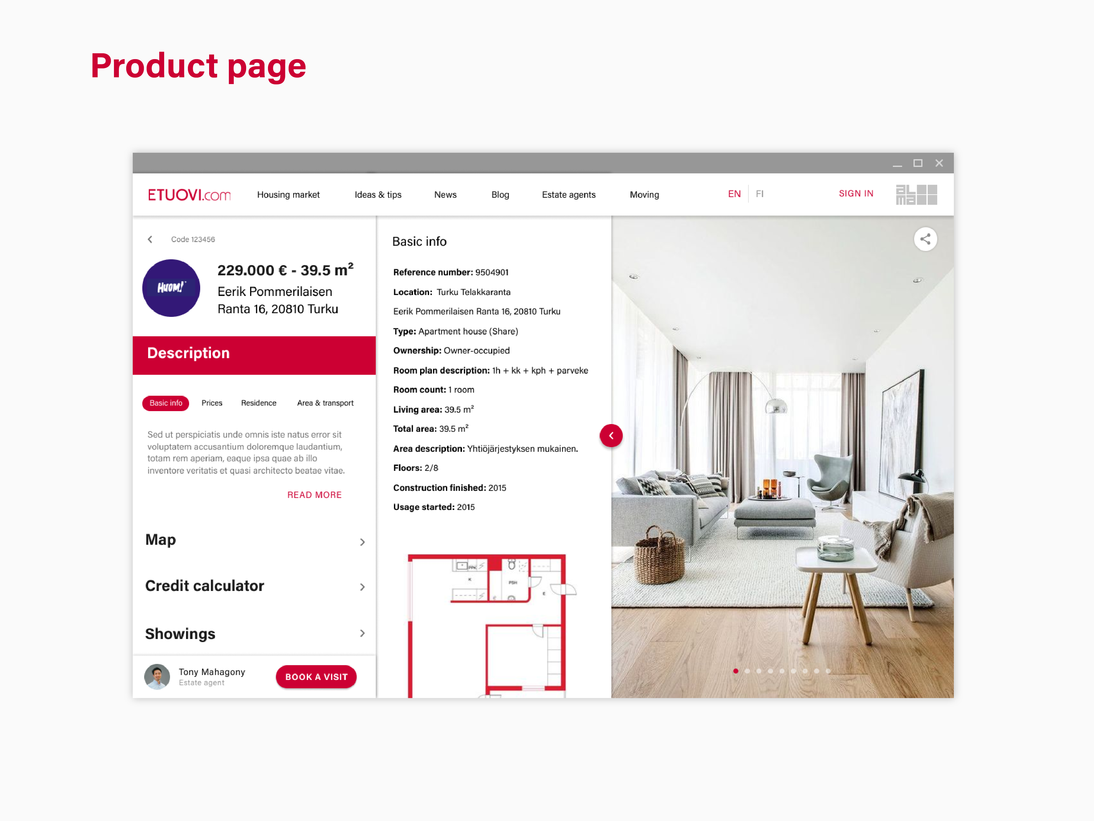
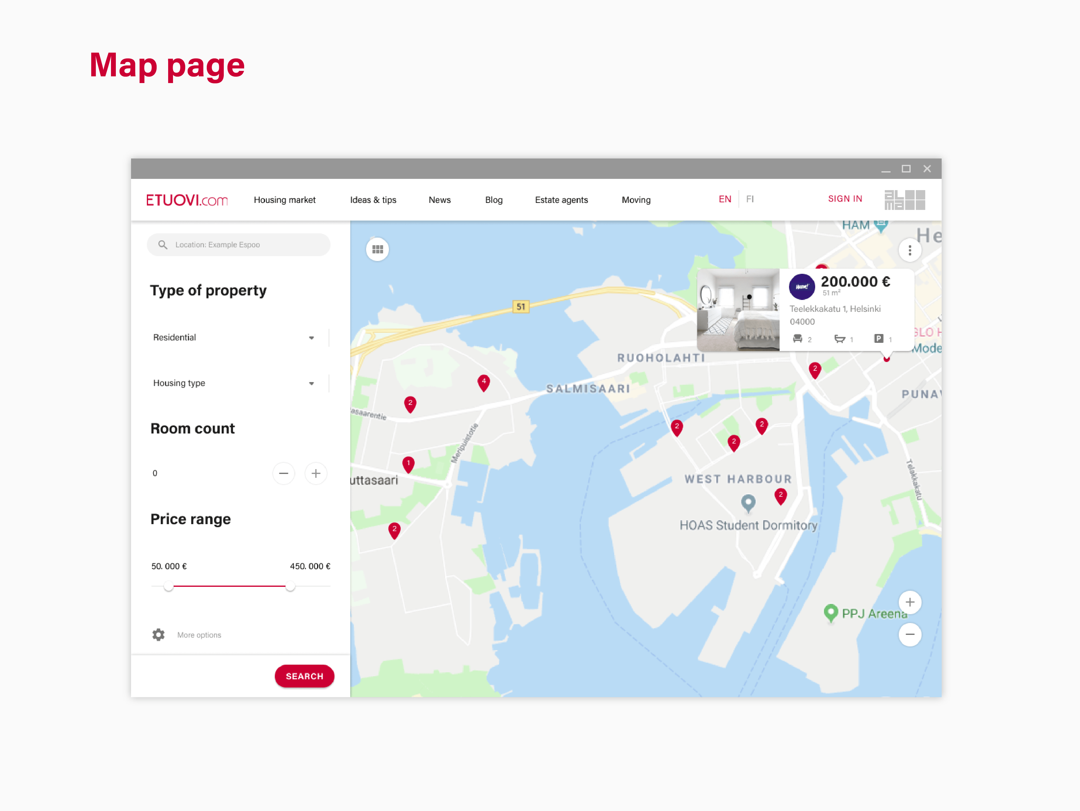
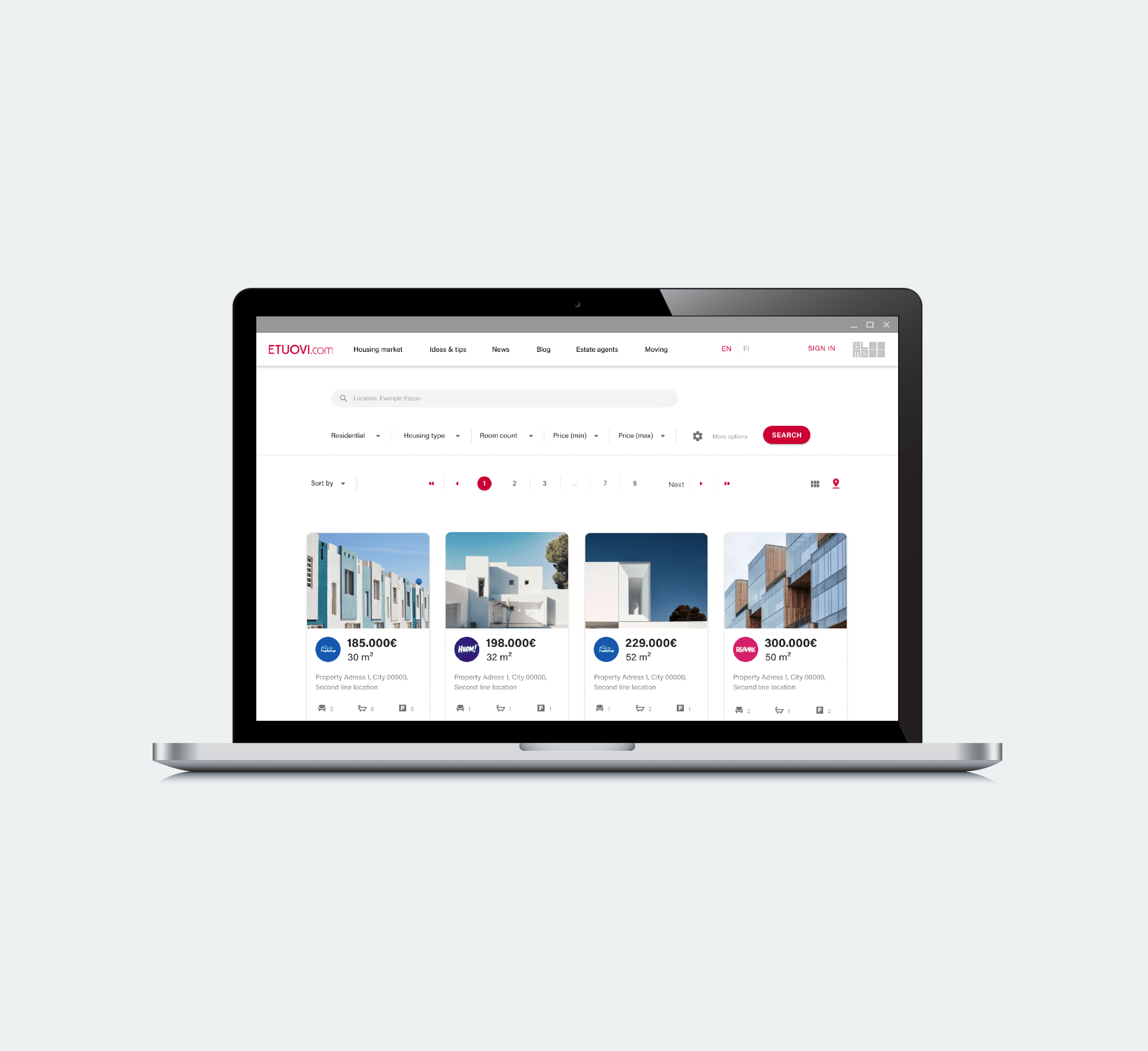
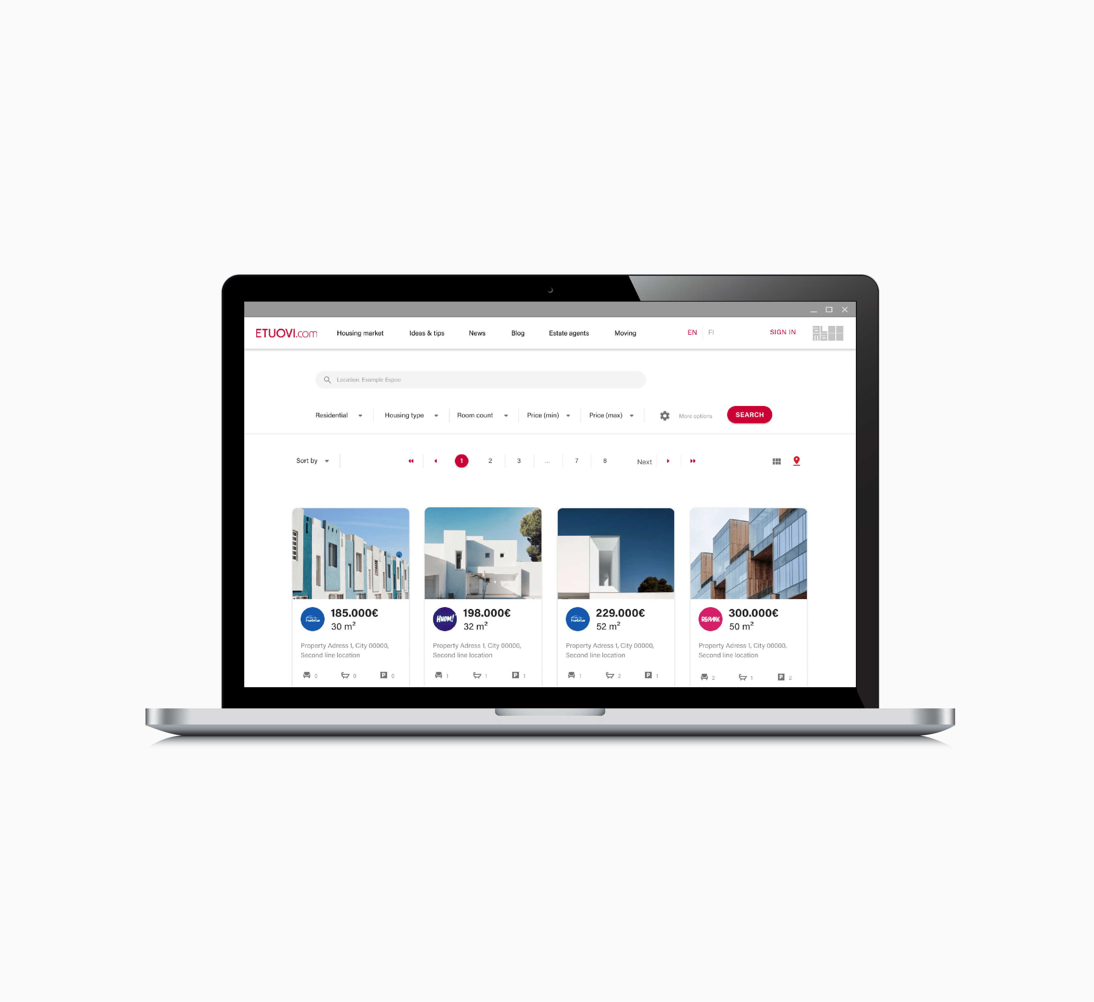
The main goal was to simplify this multi-functional website. Through this project I focused on one particular user flow, and that is: Searching for a new property. Accordingly, I redesigned landing page, search results page, searching with the map page and product/housing detail page.
To redesign this flow i took next steps:
- User testing of the current design
- Mockups with improved pain points
- User testing of the new design solutions
- Final solution, UI elements library and UI screens
1. User testing
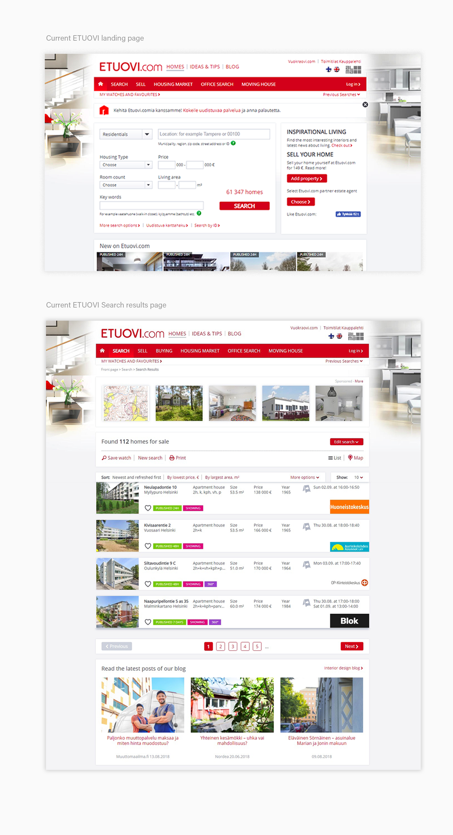
In general, during this testing, users had the impression that website is clustered and complex. The major pain points and impressions identified are :
Comment: "This looks old!" (Landing page)
1. The background photo serves more as decoration, than as an effective tool to create an experience.
Comment: "What are these offers? There are results that do not mach my search!" (Search result page)
2. After the user filled in the desired search parameters, the first line showed were default offers that were repeated from the home page.
Observation: Users eyes are scanning for too long all around the screen.
3. In general, pages are clustered, and there are too many actions user can do. The double line top menu takes a lot of space and ads to the confusion.
Observation: The eyes were straining trying to find the price of housing. (Search result page)
4. The layout and color balance are off and are not helping to see most relevant information conveniently. The accent color is not used effectively.
I used these first insights to make a design intervention.
| Create an efficient way to scan the page
| Create a visually authentic platform
| Showcase sub companies in more elegant way
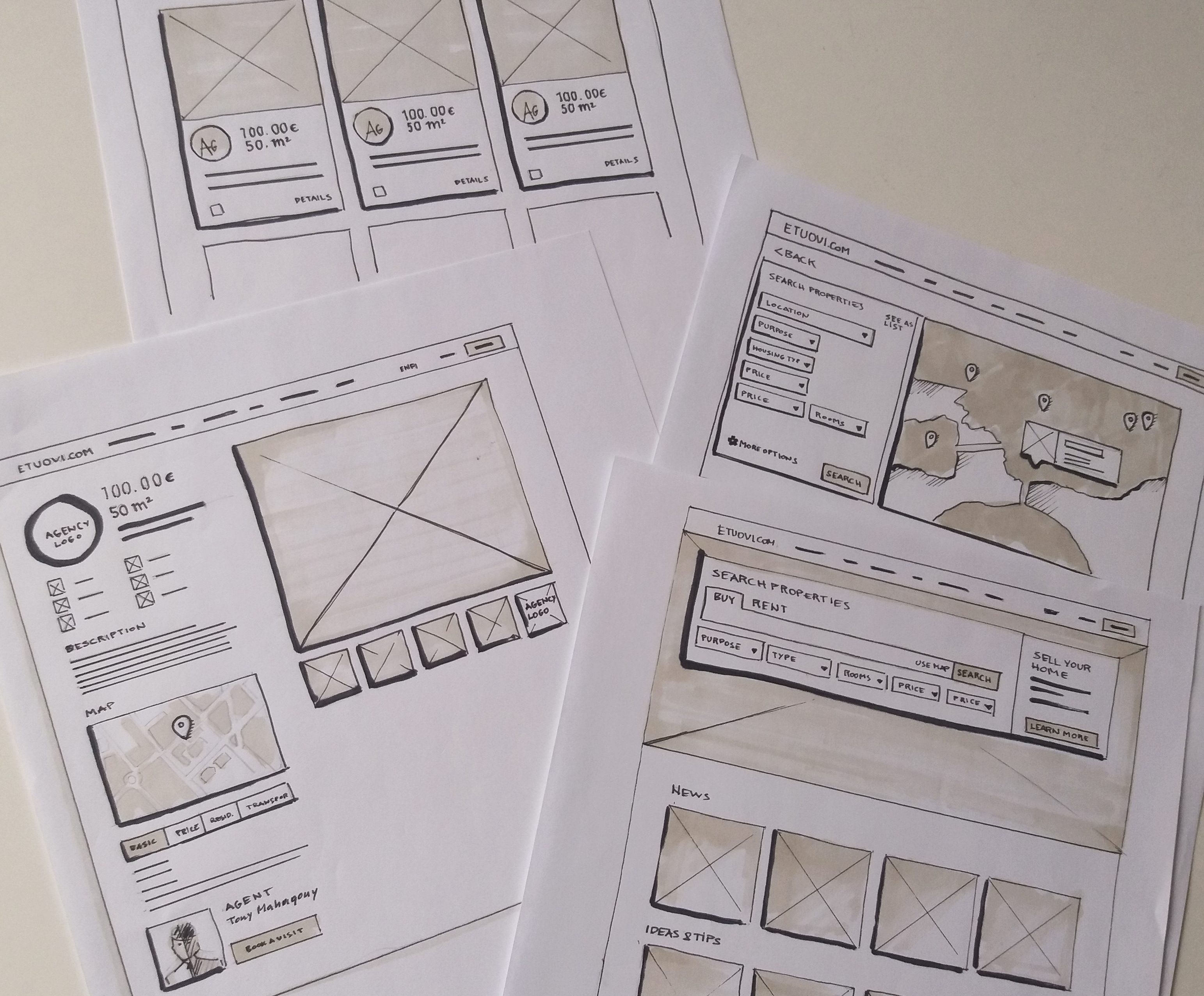
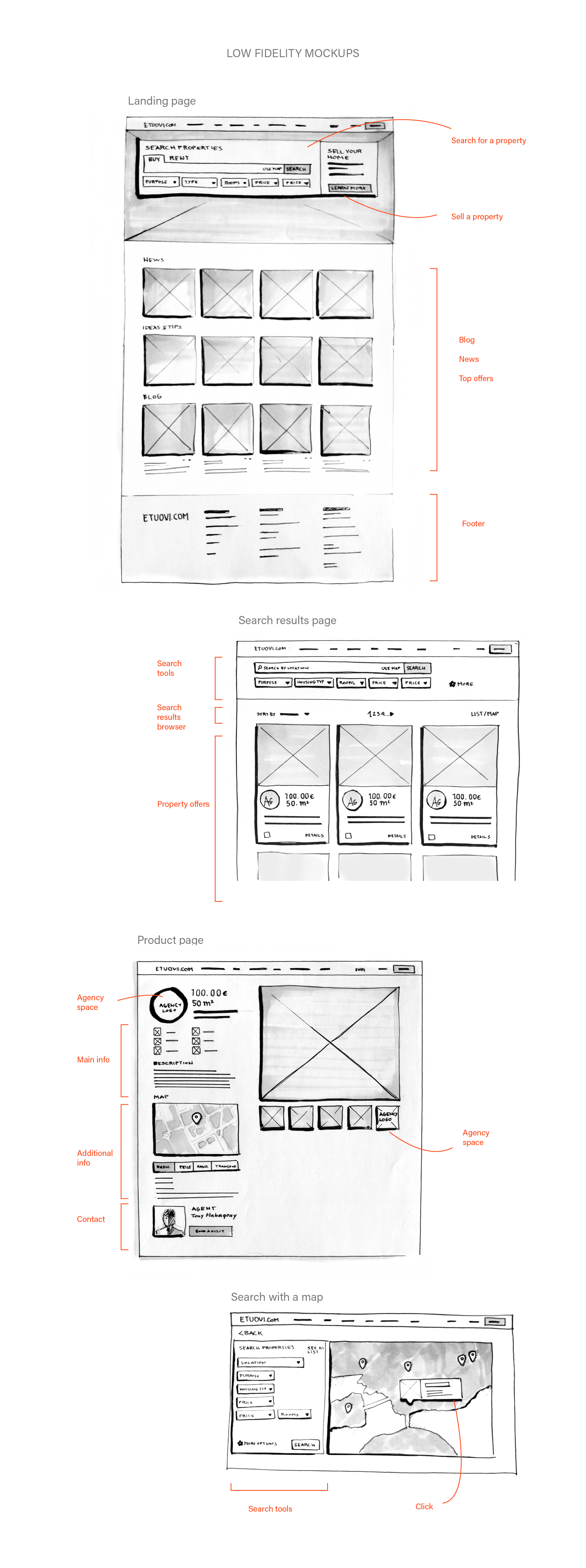
2. Design solutions
To gather some inspiration I explored the web to find some effective real-estate websites. I found www.realestate.com.au landing page quite clear and I decided to adapt this approach for Etuovi home page, and to test it again with users.
For the rest of the screens I created a more effective organization of the information. For instance the search results now display only first hand information, such as: The price, size of property and location. Also, different grid allows much larger space for property image to be displayed.
3. Second user testing
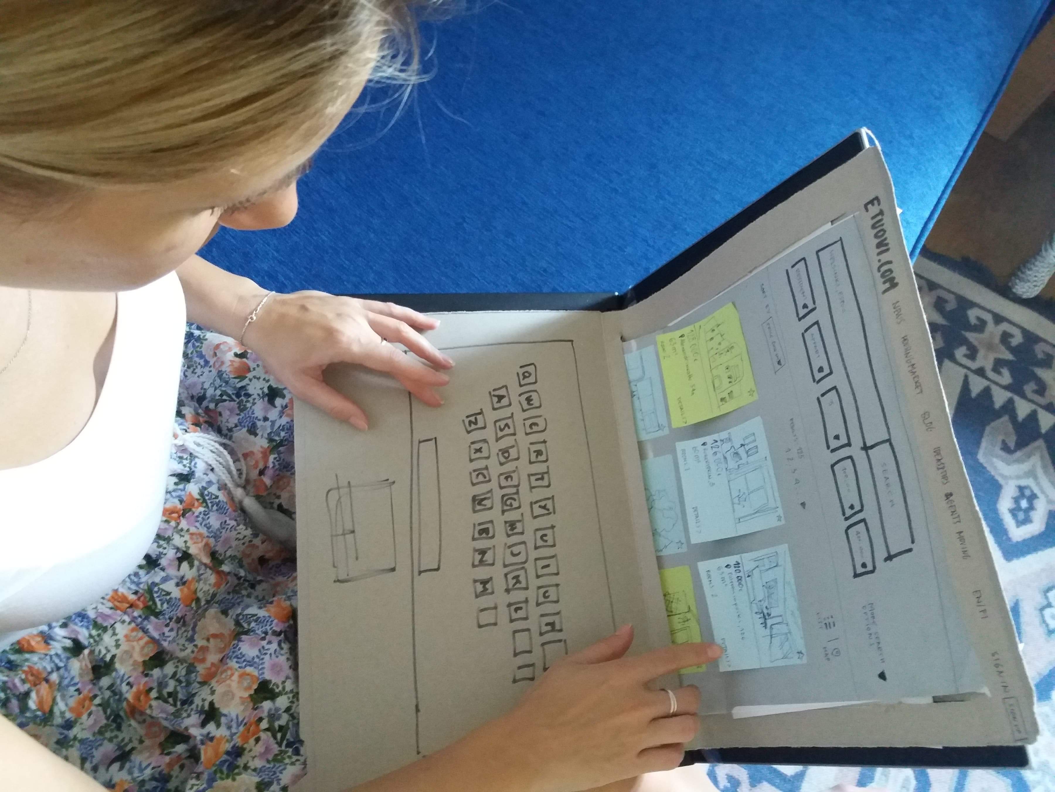
I created paper/cardboard prototype, with an aim to quickly try out new ideas, and gather more from users. I decided to do it with cardboard and paper because, I didn’t want users to feel like they interact with the final product, but rather something that is in the production stage. This prototype helped to put the user in a creative and relaxed mood.
Helsinki is a growing city, and there are a lot of people coming both Finland and abroad. To test ideas, I found a local as well as the foreigner, which have just moved to Finland, to imagine like they are searching for a new apartment.
4. Testing Outcomes
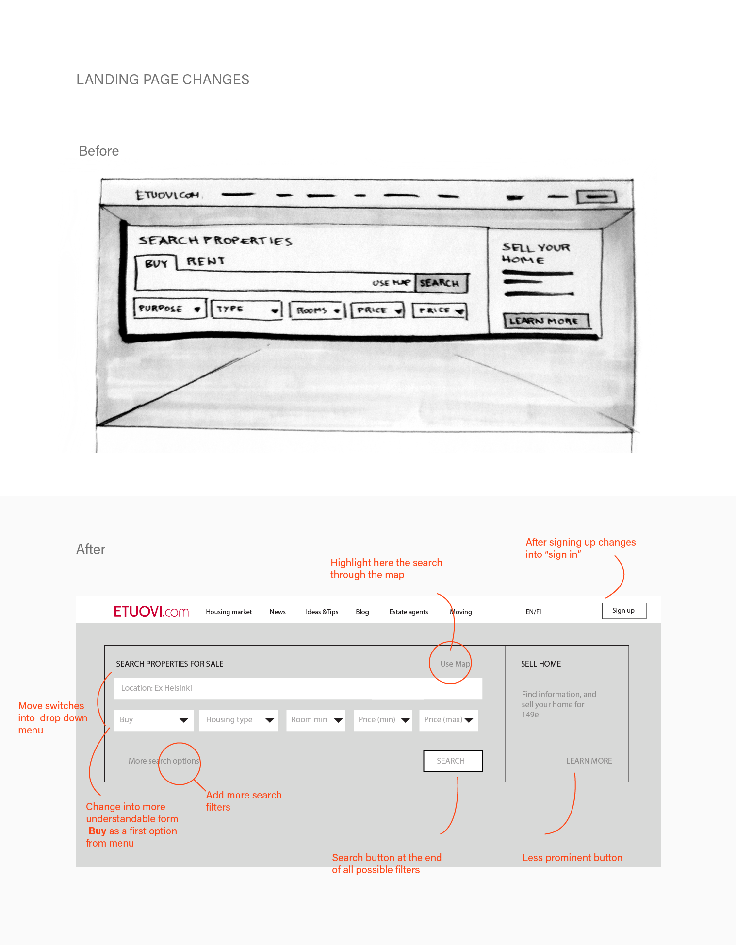
The main changes regarding interaction are related to the landing page. Users were interested firstly, at the appearance of the property, secondly, of the price, and then about the rest of the information.
Landing page
Make the, search with the map button, more prominent.
Put the search button at the bottom of all search tools options.
Map search screen
The map can have more tools, (for instance comparing the distance from the house to the office)
New ideas:
There should be a possibility to have a record of previously viewed houses without signing up
Possibility to easily compare selected house offers
Share option (to share with a family member)
